
Clear Creek has just announced their new bottle design!
When I visited Clear Creek Distillery in early September, Caitlin Bartlemay gave me a sneak peak of the new Clear Creek bottle and label design. I got the opportunity to take a sizzle picture in the still room on top of a barrel with a nice background of McCarthy’s and other barrels, for a future press release. Well, this is that press release! I’ve been diligently holding my tongue, saying nothing about the new bottles since September, despite desperately wanting to share details of my recent distillery visits. Now that Clear Creek has formally announced the bottle redesign, I can share what I know and give my personal opinions about the redesign. (Spoiler: I kinda love it.)
Clear Creek’s Instagram announcement of their new bottles, just in time for the Holiday Season.
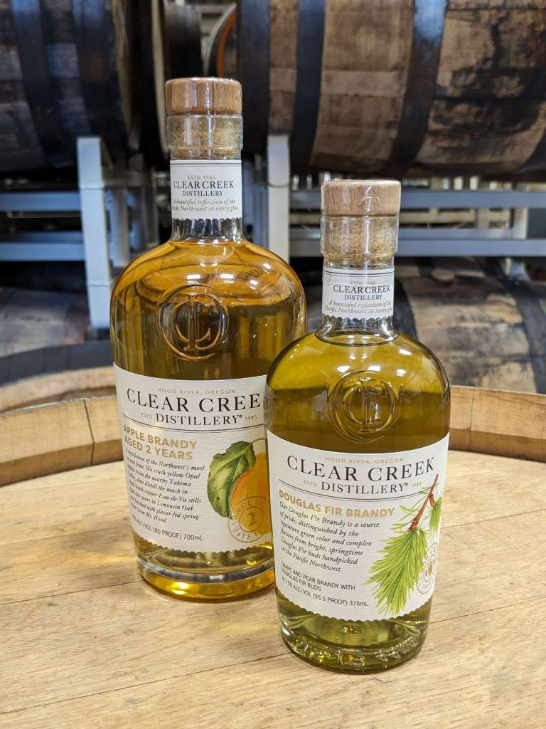
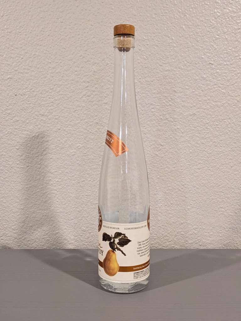
Clear Creek has redesigned the bottle they will use for their Clear Creek fruit brandies and liqueurs, replacing the iconic former design of the elegantly tapered, extra tall bottle familiar to fans of the brand. The new bottle is a more standard squat aspect ratio that still features an elegant taper and a label that maintains continuity with the brand imagery. The label will feature the Clear Creek Distillery name, the product name, and a short paragraph about the product, as well as an illustration of the fruit or infused botanical appropriate for the product.
The bottle redesign is “just new packaging for Clear Creek brandies and liqueurs,” said Caitlin Bartlemay, Head Distiller of Clear Creek Distillery, confirming that the redesign will not affect Clear Creek’s other brands which are released under separate labels, such as McCarthy’s Oregon Single Malt, Trail’s End Finished Small Batch Bourbon, Timberline Vodka, and Old Delicious Double Bourbon Barreled Apple Brandy. She also confirmed that there will be no change to the high-quality fruit brandies and liqueurs we know and love. That is, of course, beyond the usual batch-to-batch variation, which has always been remarkably consistent in my experience with the brand.
The former bottle design is well-known and beloved among enthusiasts and fans of Clear Creek who own their own bottles of Clear Creek’s high quality real fruit brandies and unique and specialty liqueurs, but the bottle shape and label design had some issues of practicality, particularly when you consider its place in stores and on bar shelves.
The previous design was tall and slender, which, while iconic and beautiful on a shelf, unfortunately was sometimes difficult to fit on a standard bar shelf. If there’s room for it to be displayed, it stands out prominently. However, I’ve also seen a Clear Creek Pear Brandy bottle behind least one bar where it was necessary to store the bottle outside of the usual shelf area, more or less out of sight, where there was more vertical room for it. That’s a shame for what would otherwise be a lovely bottle to display.
The design had other problems as well, Bartlemay mentioned to me in a sheepish aside. The multi-piece labeling of the bottles was a pain to apply, with a gilded arc reading “Pure Fruit” running partway around the bottle’s long neck, as well as the single-panel label which wrapped nearly all the way around the bottle. Styling aside, this design apparently left some liquor stores, bars, and customers feeling like the label didn’t have a satisfying “front” panel. Instead, the “left side” of the label seemed to be the most logical side to have facing outward, even if that seemed to be displaying the bottle off-center.

Above: The old bottle design showing the “left” half of the main label panel, the “middle” and the “back”.
The new bottle design and label has the advantage of having a clear front side. The new label prominently features the “Clear Creek” branding as well as an illustration relating to the type of brandy in the bottle, which is a quintessential component of the labeling of Clear Creek brandies and liqueurs. This serves as a nice through line between the old labeling and the new labeling. The product name is also easy to find right below the brand name, and the labels feature a tasteful short paragraph describing the product on the front of the label.
These new bottles for Clear Creek Brandy products are a more standard height and width but still have a tasteful taper and elegant shoulder. It’s a great relief that these new bottles don’t fall into the “Aspect bottle” category, which you’ve likely seen hundreds of times before. The Aspect bottle features a half-sphere for the shoulders sitting on top of a cylindrical body, with a smaller cylindrical spout to pour from. Many brands have made use of this shape at various times. It has appeared in everything from Clear Creek’s previous bottle design for the two-year-old Apple Brandy, to Russell’s Reserve Bourbon.
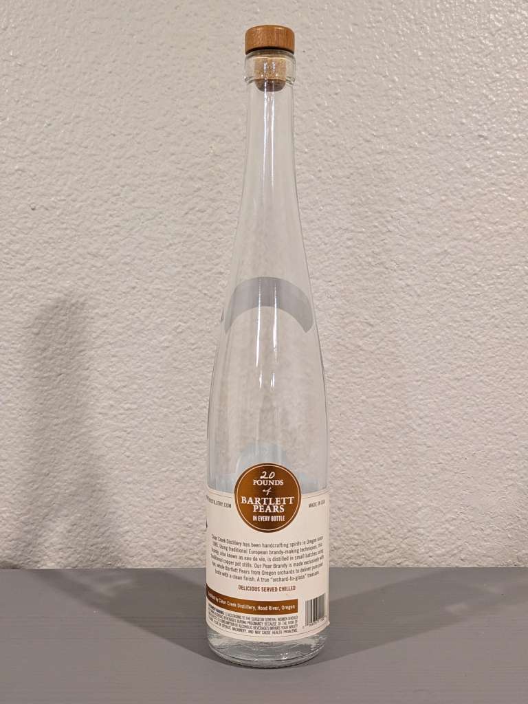
As someone who appreciates a balance of brevity against information and transparency on a bottle, I appreciate the short paragraph which describes the product without too much fluff or unnecessary detail. Unlike some other labels that rely heavily on text in a handwriting script or otherwise, the text on these labels is brief and highly legible. The bottles also feature a minimal back panel which is pared down to essentially just a barcode and the Surgeon General’s warning.
Another interesting note is that the new full-sized bottle comes in a 700ml size, which makes it immediately ready for the European market, positioning Clear Creek to easily export their products to additional countries where there is demand and opportunity. With this change, Clear Creek joins the wave of smaller brands with wider geographical distribution in adopting this form factor, newly allowed domestically since the end of 2020, which allows brands to streamline their product lines for both domestic and global markets.
Last but not least, the new bottle comes prominently emblazoned with a beautiful new logo for Clear Creek Distillery, embossed directly on the glass of the bottle, featuring the letters “CCD” in a beautiful monogram sigil. This sigil appears to serve as a subtle nod to Hood River Distillers’ house unity, joining such monograms affixed to many of HRD’s other brands, for example Big Gin’s monogrammed “BG” logo.
While fans will find the departure of the outgoing Clear Creek bottle design to be bittersweet, we will remember it fondly as we embrace the lovely new redesign, both for its beauty and its practicality.
Interact with this news on Instagram:
